Designing the Global Network for
Makers and Maker Spaces

PROJECT TYPE
Team project of 3 UX Designers.
CHALLENGE
• Help the primary users find the resources they are looking for in the smoothest and most effective way.
• Bring two products into one seamless experience for all the users of Makernet.
• Create a product with a sense of community.
PROPOSED SOLUTION
• Create a scalable public website with flowless access to the members’ and managers' internal panels.
MY ROLE
• Product and User Research - Product analysis, comparative and competitive analysis, user interviews, contextual inquiries.
• Interface Design - Feature prioritization, sketching, and prototyping.
3 weeks
DURATION
Figma
MAIN TOOLS
Discovery & Research
Makernet is a non-profit created for the Makers universe, from hobbyists to those who do it for a living. It is a platform that interconnects the Maker community and offers resources to help them grow and succeed.
What do Makernet do for the maker community?
• Help Makers find the spaces and tools they need.
• Help Makerspace Managers run their space more efficiently.
• Help Makers connect with other makers
• Attract new users who might not be familiar with the Maker Movement.

MAKERNET USER GROUPS

PRIMARY USERS

HEURISTIC EVALUATION
Lots of available resources, too many barriers to accessing them.
The current design consists of two separate products, a public site and a private panel for members and space managers, and it is not a scalable design.
• The public website is primarily informational, targeting only managers of makerspaces, not the makers.
• A private panel is accessible from a different URL that is not easily accessible. It is a dated design that requires a long learning curve to offer a satisfactory experience.

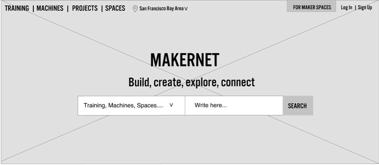
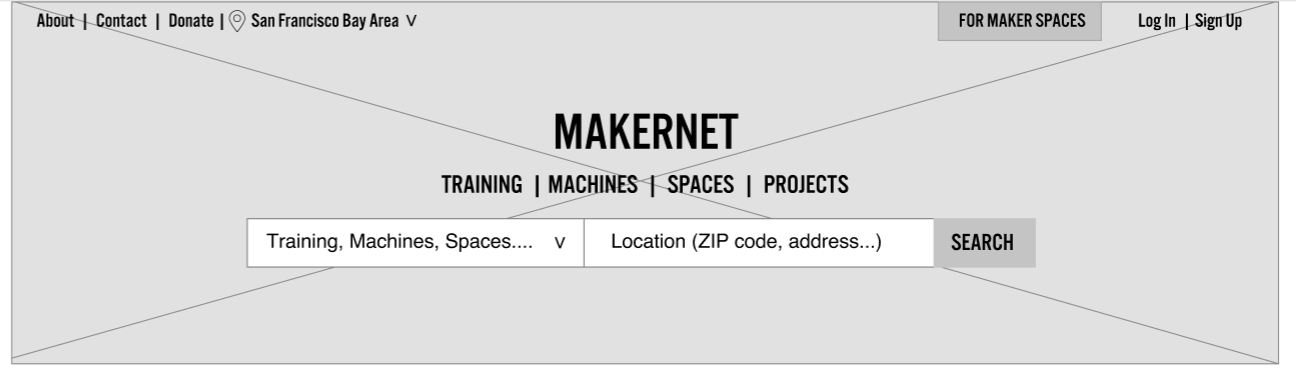
PUBLIC WEBSITE
- No clear flow and lack of direction.
- Hard to know what Makernet is and what you can do there.
- Excessive and repetitive text site-wide.
- There is almost no interaction to help users achieve their goals.
- No access to the private panel of a specific makerspace.

PRIVATE PANEL
- The design was created to be used separately per makerspace; it is not a scalable model:
• Lacks search capabilities
• The filtering is very limited and not useful
- Location is not a parameter
- Outdated calendar that is not easy to interact with
- No option to edit or cancel events or bookings
- Many of the features don’t work well or haven’t been developed
INTERVIEWS & CONTEXTUAL INTERVIEWS
Users’ experience with Makernet’s current products
- Confusion about Makernet’s purpose
- Frustration trying to complete certain tasks
- Limited features to achieve their goals
- Confusion about functionality
- None of the products engage the maker community
- Most testers tried to book machines or training


Affinity map created after the feedback we received from user interviews. This method helped us synthesize data to find patterns.
KEY INSIGHTS
• The maker community is proactive, enjoys the ability to learn things and make changes on their terms.
• Difficulty finding maker spaces, tools, and training.
• Interest in having access to multiple spaces and transferring certifications.
• Lack of knowledge about training and safety best practices.
PERSONA
Continually keeping our primary user in mind.
We developed a Persona based on the data of the user who is actively using Makernet: the New Student User to help us prioritize the content and features, and narrow the scope of the design.
We spoke to people from a variety of backgrounds, including current student users at Alameda Fablab, one of Makernet’s current users, to understand their behaviors, needs, and motivations.

USER FLOW
Creating a more efficient Structure & Flow
We focused on improving the onboarding flow for this student who needs to book training to start using the machines for the first time.


The flow would the new student user take to complete the task to book a training.
Proposed solution
• Moved away from the private panel because that model is not scalable.
• Integrated into the public site key features and content from the working panel that will help users find the resources in a seamless and intuitive experience.
• Incorporated other features that will help Makernet be more scalable, such as a search bar, advanced filters, and geo-location.
• Added content to engage users so they will be more likely to sign up, and become part of the brand and (probably) the maker movement.
The Design Sprint

IDEATION + TESTING
Evolution of the navigation after testing.
After testing and iterating in the main navigation and search bars, we opted for simple, precise interactions to make things happen quickly and intuitively.
• Simplified search bar; from the “directed search bar” initially proposed.
• Grouped main actions into two main categories: “Learn” and “Get things done”.
• Moved up “how it works” to have it visible before scrolling.
• Created a call to action to invite space managers to become part of the network.
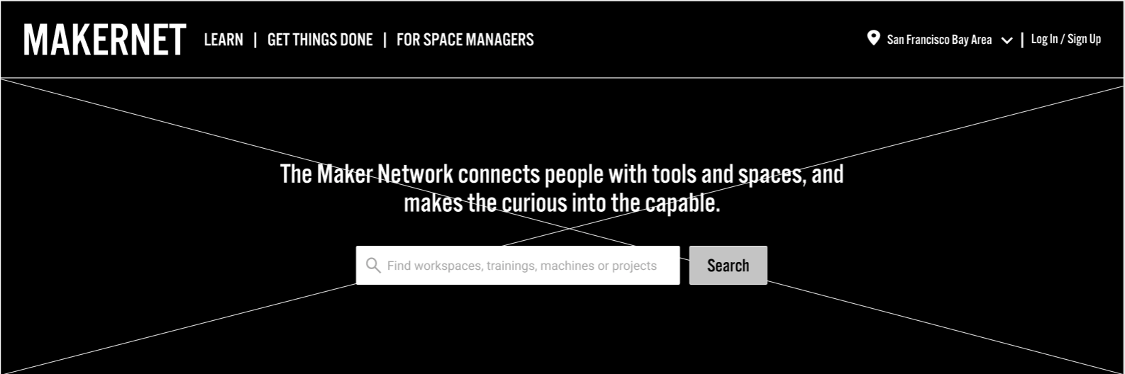
Final Design
Our final screens and the interactive prototype (button below).
HOMEPAGE

Notes highlighting the interactions in the homepage.
TRAINING LISTING

Listing section with filters for a faster search.
USER ACCOUNT DASHBOARD

Private section with User information (after Login or Sign In).
FINAL DELIVERY
After one week of research and two weeks of a design sprint, we successfully delivered our research findings and analysis, wireframes with annotations for the developers of Makernet’s team in Figma, and a clickable prototype.

The result of the 1st design phase
• Moved away from the private panel because that model is not scalable.
• Integrated into the public site key features and content from the working panel that will help users find the resources in a seamless and intuitive experience.
• Incorporated other features that will help Makernet be more scalable, such as a search bar, advanced filters, and geo-location.
• Added content to engage users so they will be more likely to sign up, and become part of the brand and (probably) the maker movement.
Closing Notes
• Based on our research and usability testing, our design proofs to make it easier for makers to find the resources they need and complete the tasks in an easy way.
• My team and I successfully improved the usability and accessibility of Makernet’s platform by redefining its structure and implementing scalable features and intuitive interactions resulting in a seamless experience for its primary users.
• The next step will be to develop the structure that incorporates all the players of the Makernet community.